SharpFit
Personal Project
Graphic design + branding
London, 2026
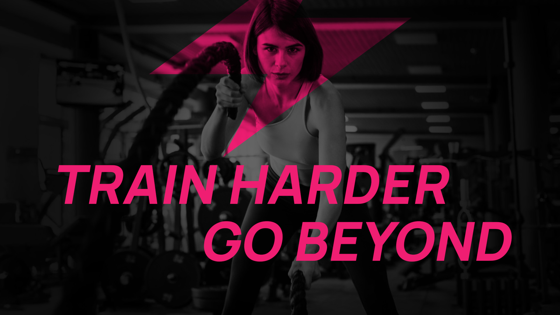
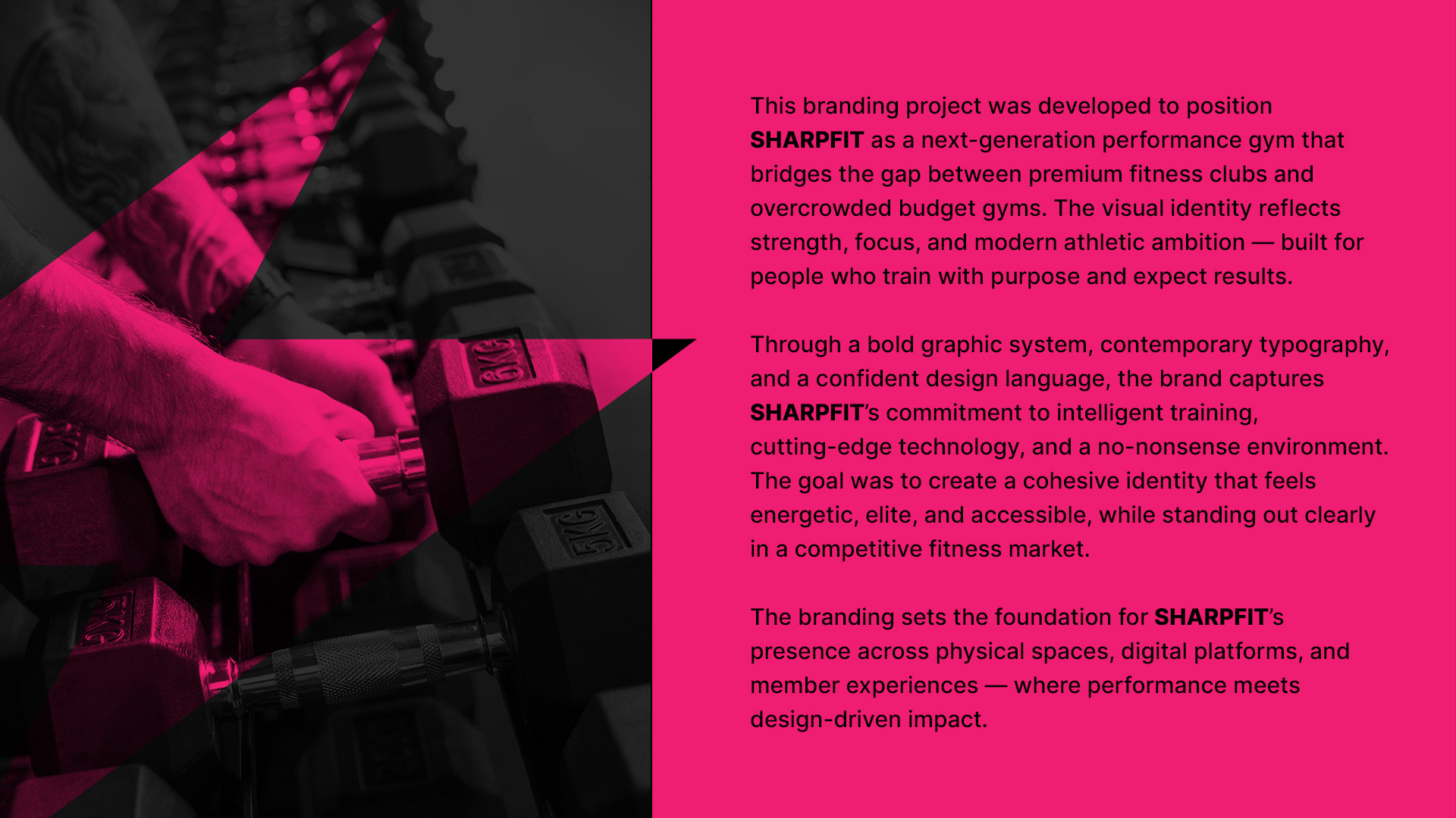
SharpFit is a conceptual gym brand designed to represent a modern, performance-driven gym experience. The goal was to create a visual identity that communicates precision, confidence, and accessibility while standing out in a saturated market. The project aimed to appeal to a broad audience without relying on the intimidating or overly aggressive aesthetics commonly associated with gym culture.
The main challenge was to balance strength and approachability within a single brand system. In my research of competitors, I found out that many fitness brands either feel too intense and exclusive or too generic and cheap. This project explores a middle ground, creating a brand that feels premium yet inclusive, structured yet flexible.
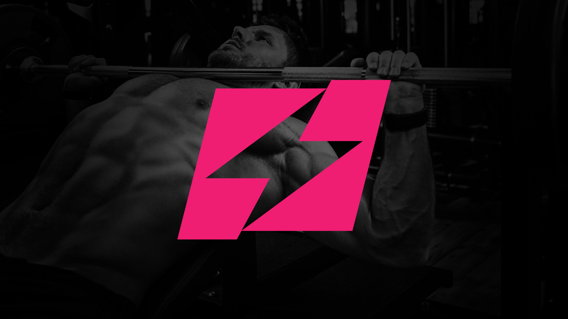
The concept was built around the idea of precision training combined with a modern lifestyle approach. It begun with the name, a catchy name that represented the value of the business. Next, I tried to represent that concept into imagery: a bolt is sharp, fast, acute and its visual representation very powerful. And it also has a disruptive power, the energy necessary to break the routine and feed the necessary inspiration to achieve goals. Once I’ve got this vision, the whole project came into life: the use of clean layouts, sharp geometric forms, and a minimal visual language to convey clarity, control, and confidence. The identity was designed to feel strong and refined, using bold typography, a flexible logo system, and a restrained colour palette to maintain consistency and impact.
The final outcome is a cohesive brand system applied across multiple touchpoints, including physical environments, merchandise, marketing materials, and digital platforms. The result positions SharpFit as a contemporary and accessible fitness brand, demonstrating how a clear and consistent visual identity can shape both perception and user experience.

Introduction
About the project
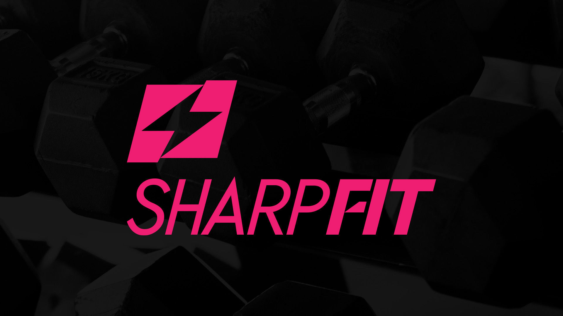
The main logotype - line logo
The main logotype - stacked logo
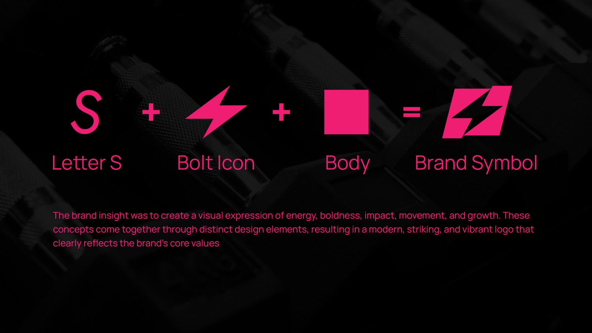
The inspiration for creating the brand
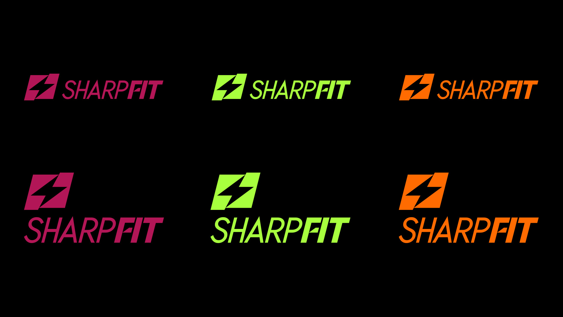
Logo colours
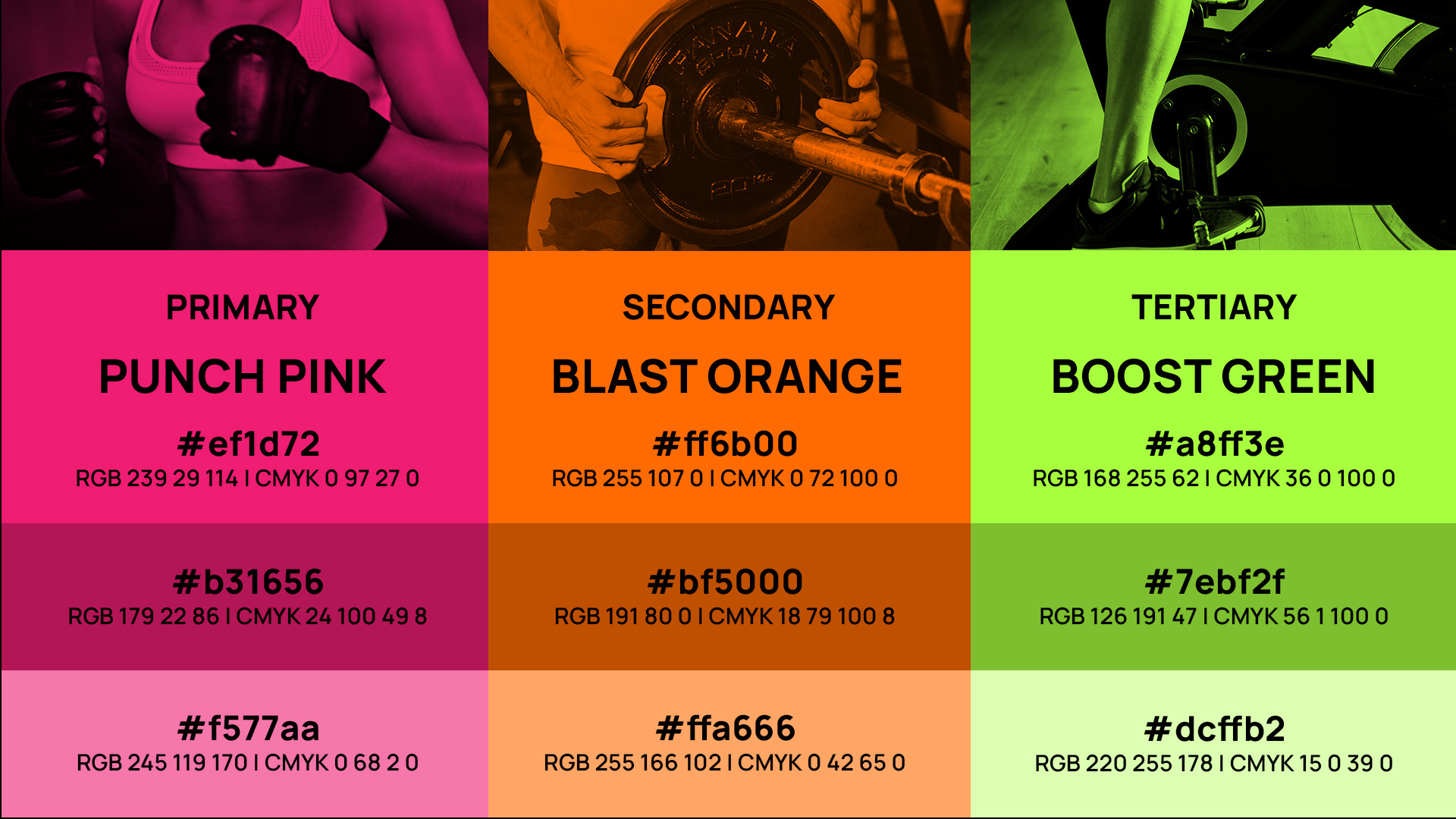
Colour palette
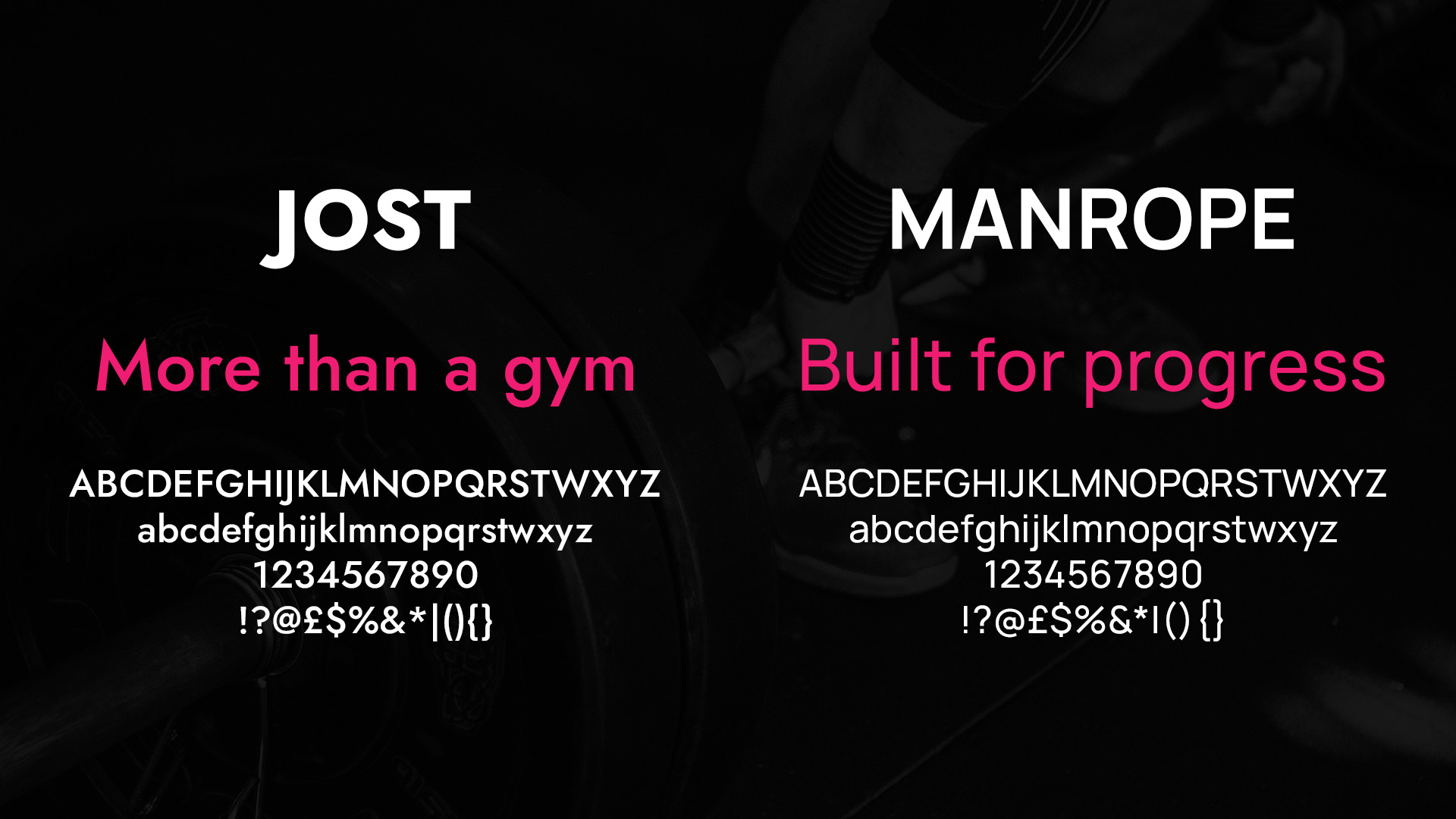
Typography

Stationary
Bottle + Lanyard
Uniform
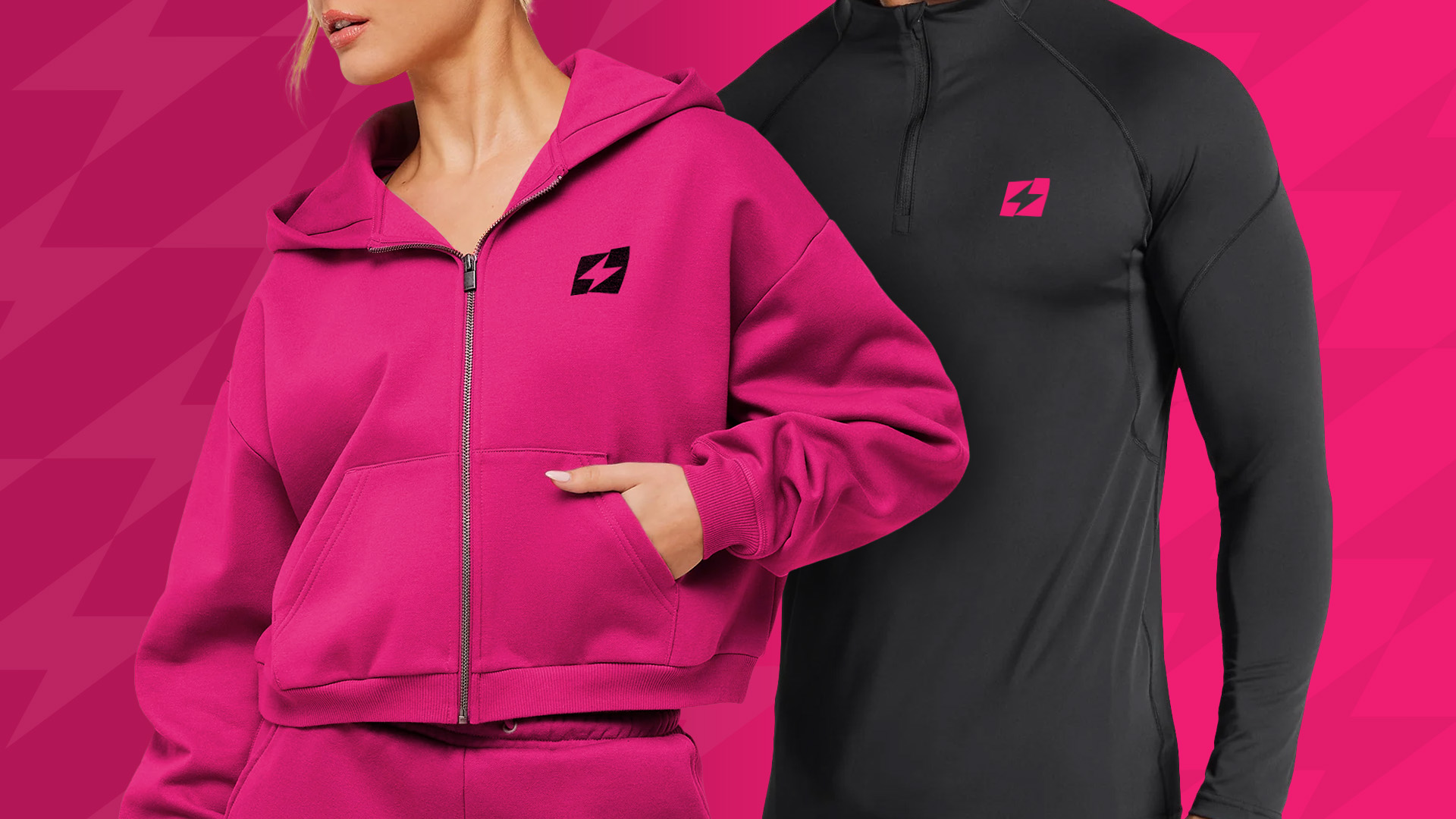
Uniform
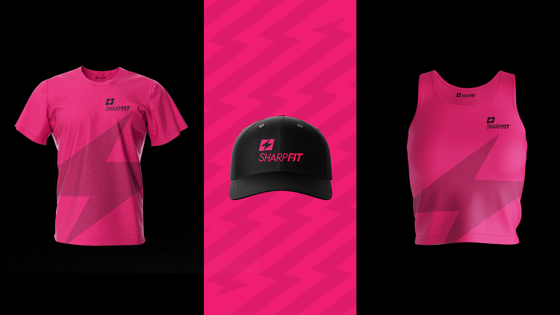
Merchandising
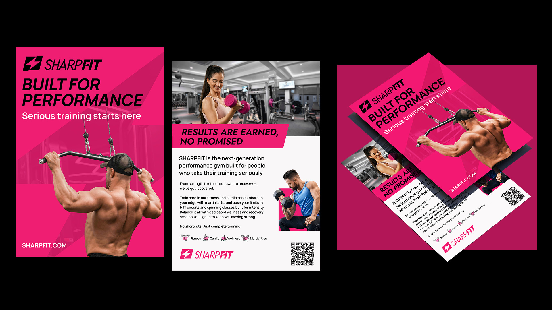
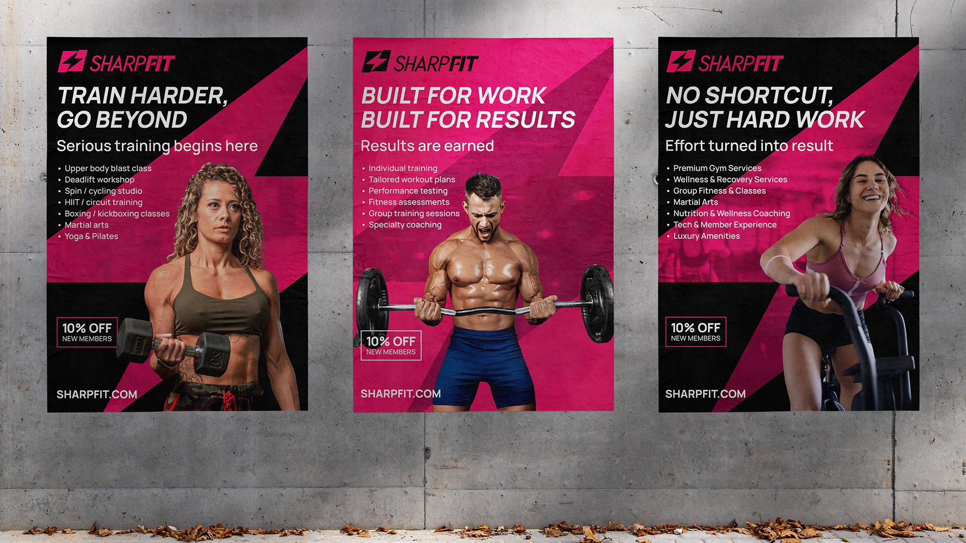
A5 Flyer
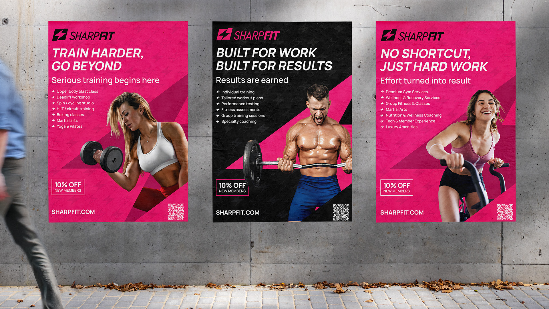
A1 Poster
A1 Poster
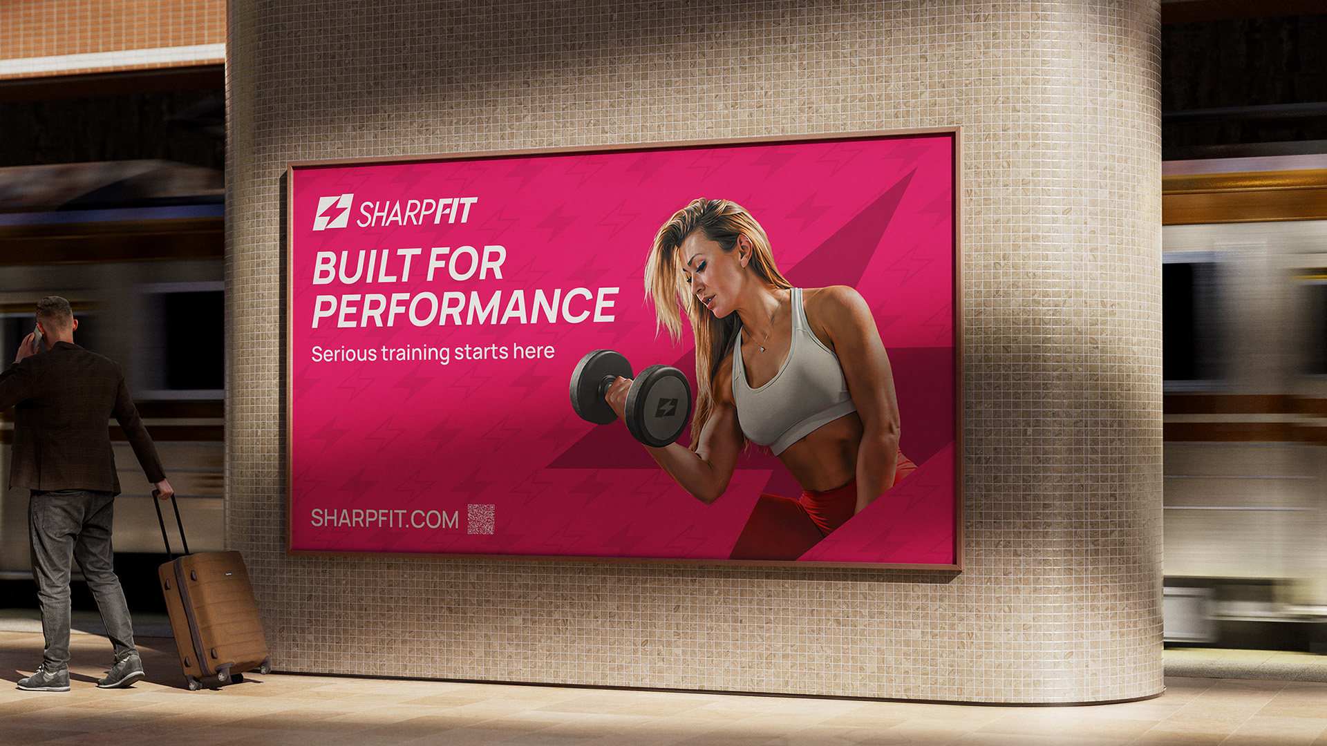
Tube Ad
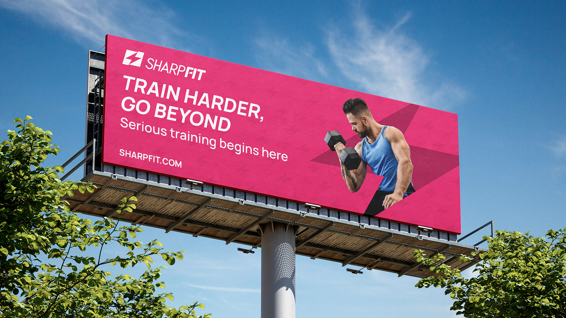
Outdoor
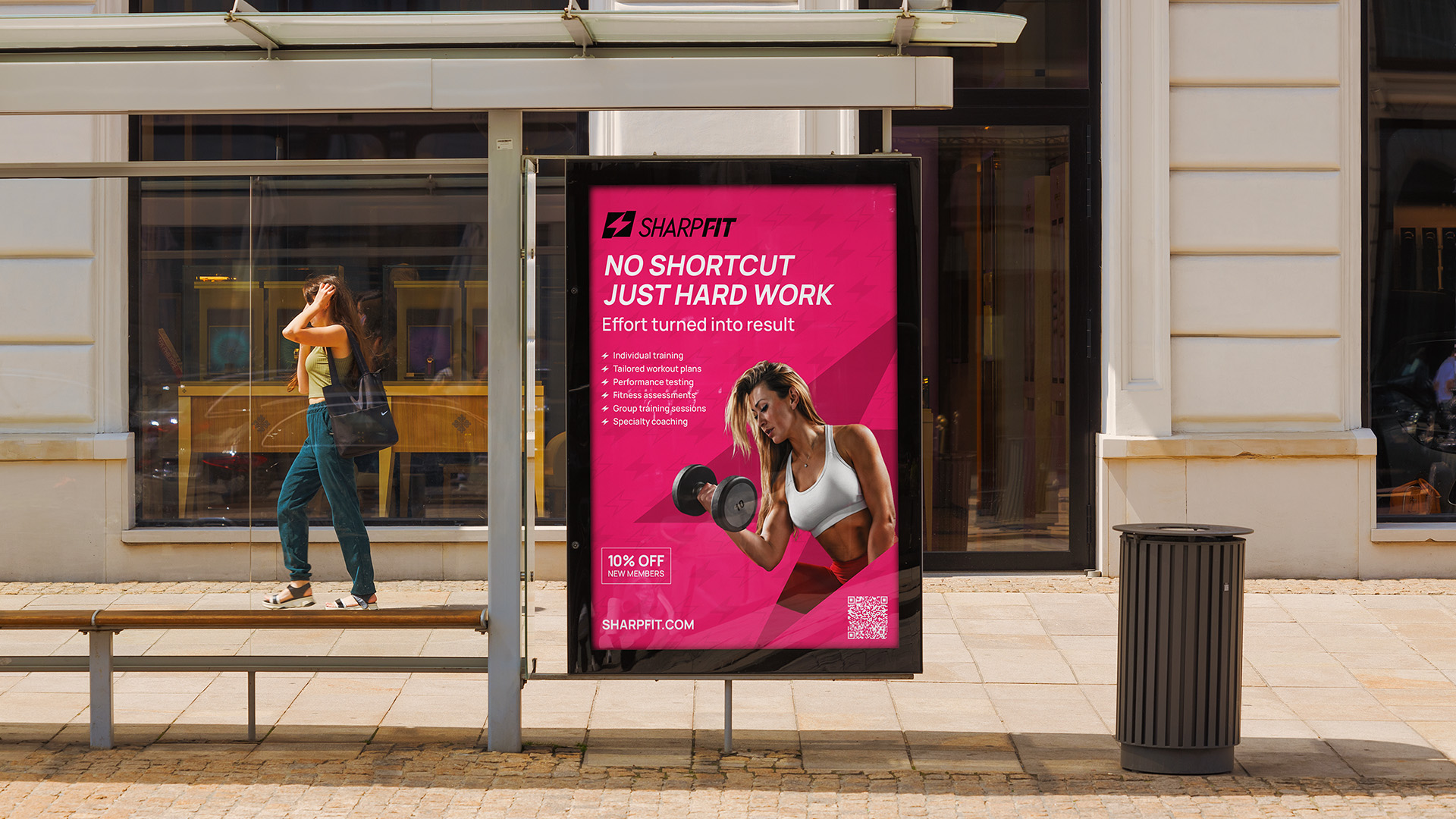
Busdoor
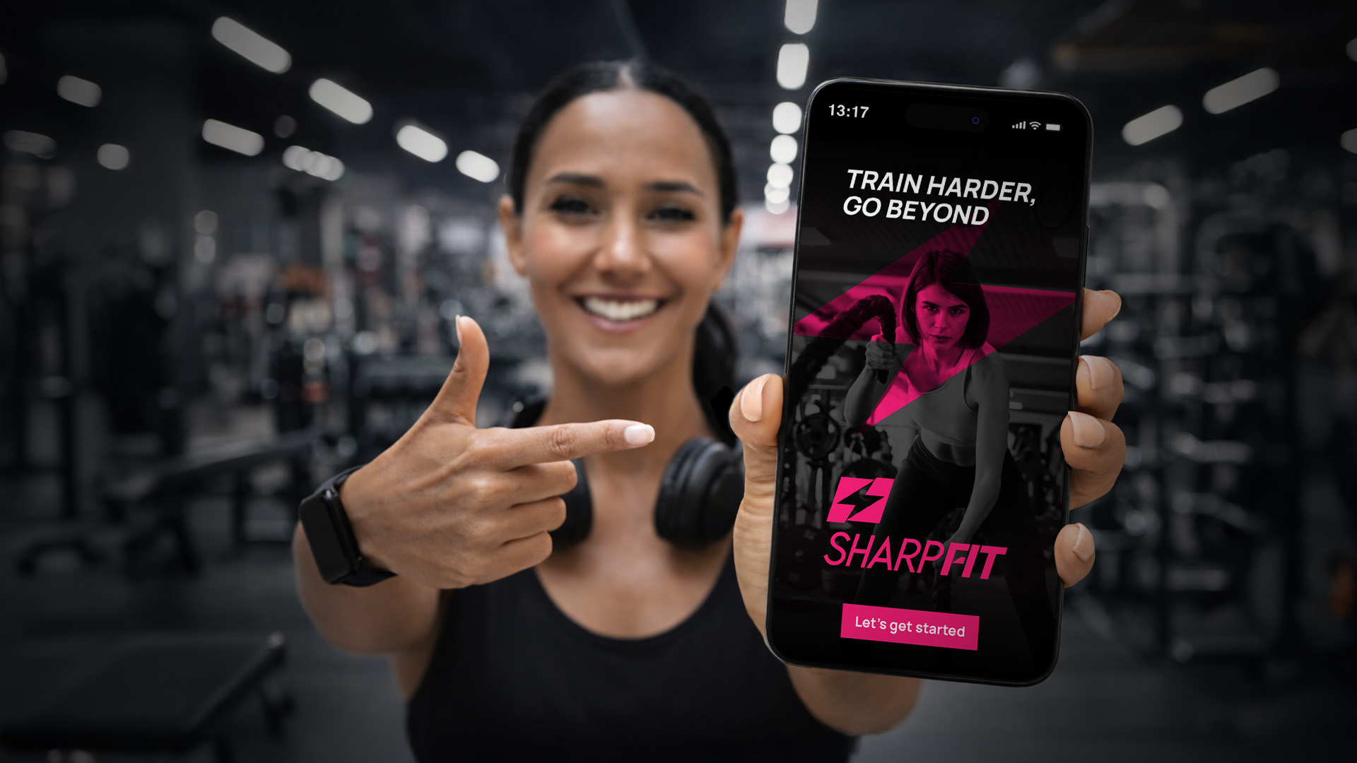
App
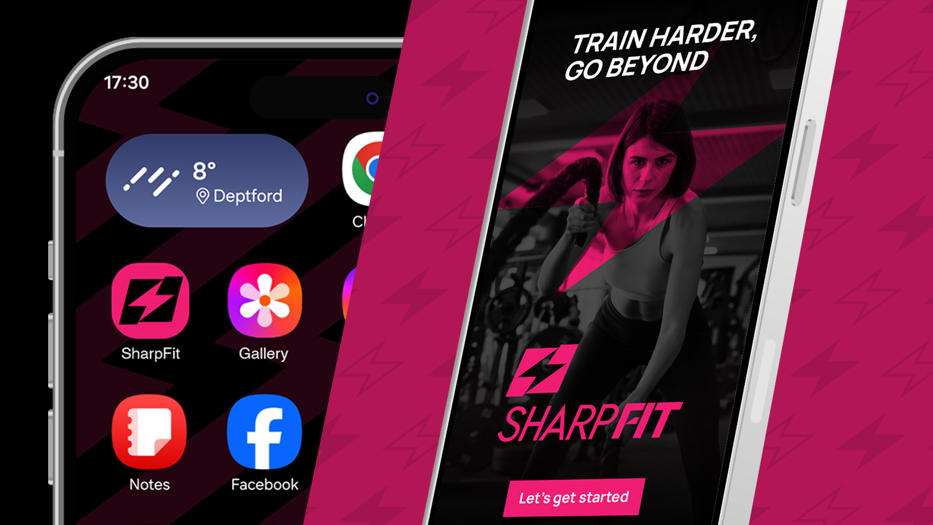
App
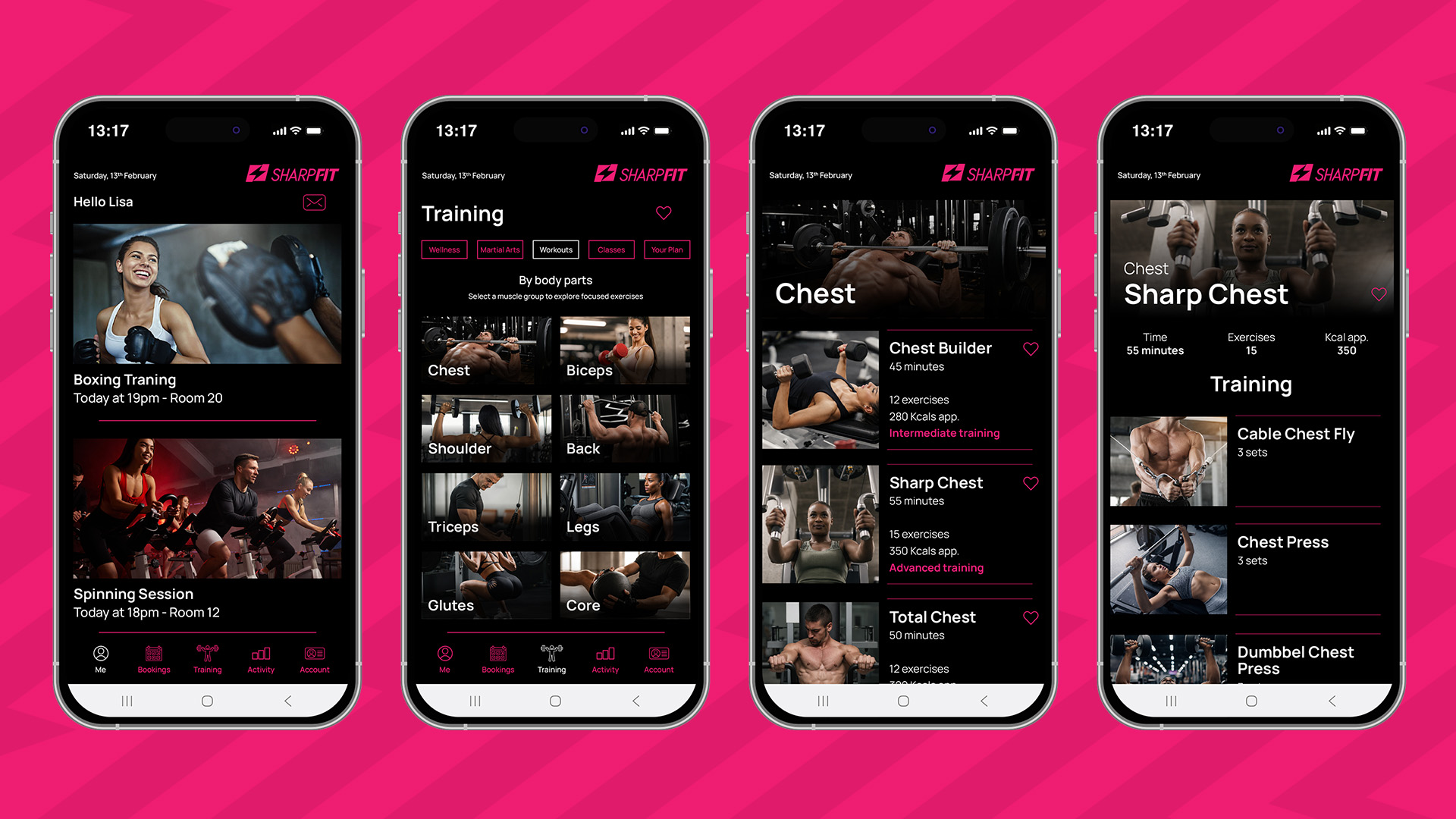
App
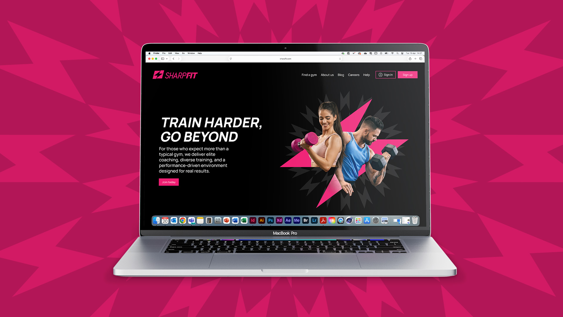
Website
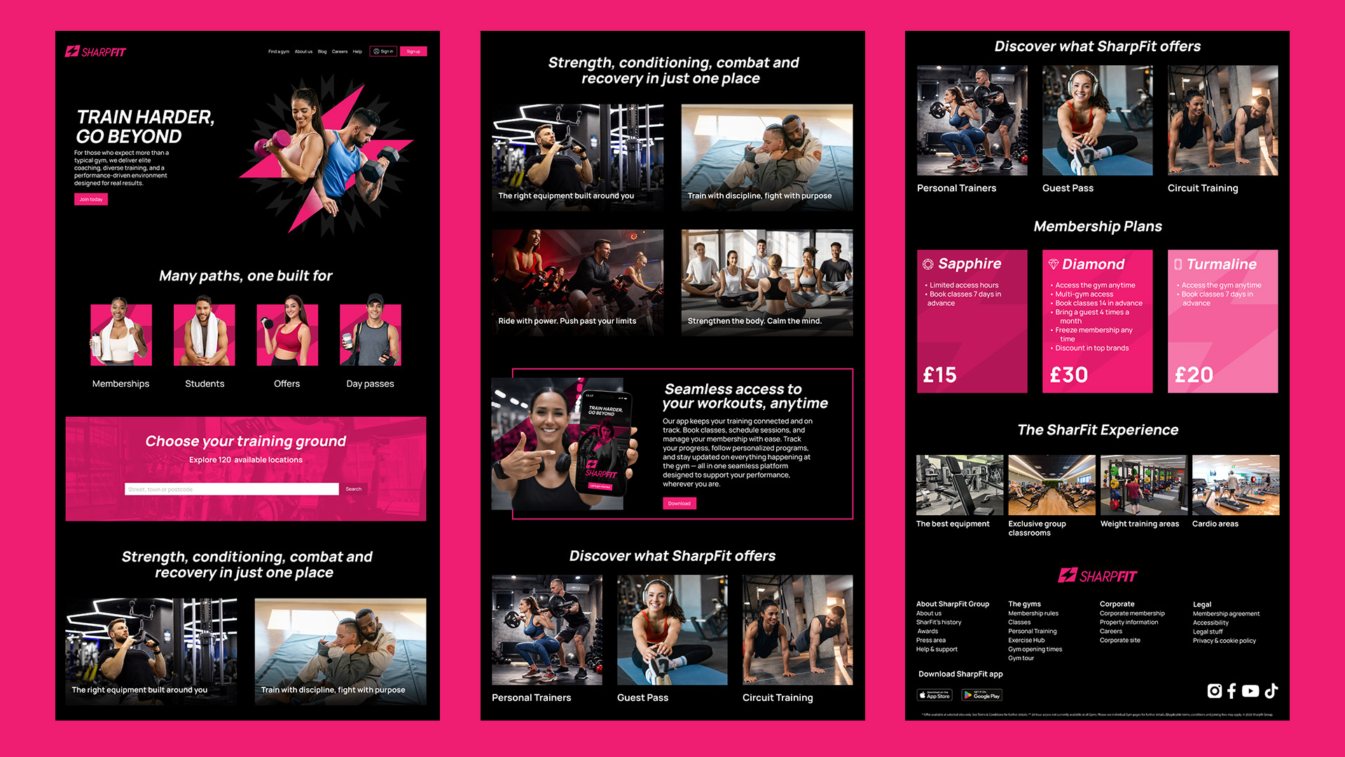
Website
Paid Ads
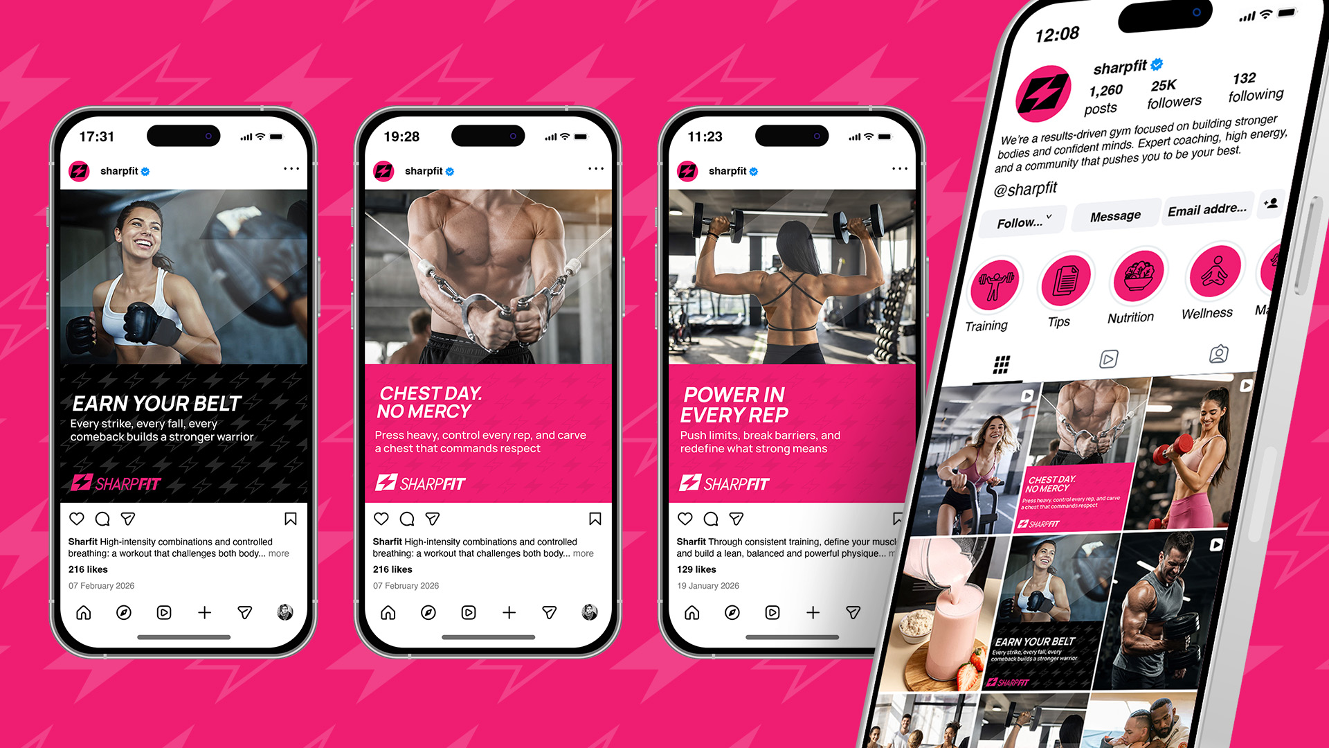
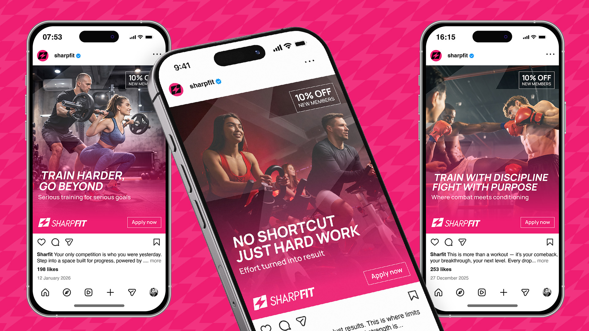
Social Media
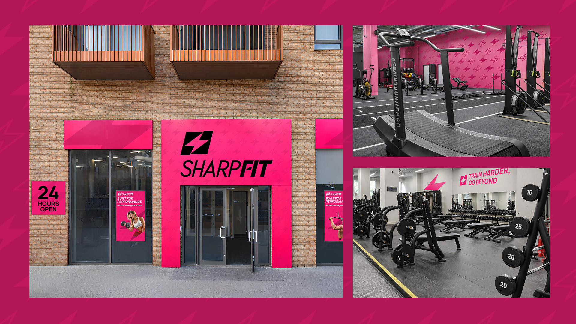
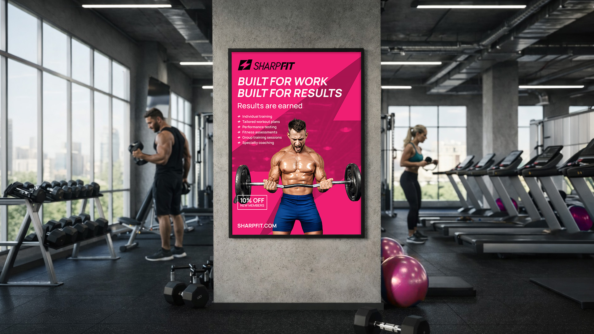
Gym Facade
Thanks for Watching!
Back to top of page